Did we just see the proverbial kiss of death? OK, “death” might be a bit of a strong word, though “extreme frustration” wouldn’t mischaracterize what the market has been doing, and still is doing. Just when it looks like stocks might ready to make a meaningful move, something gets in the way.
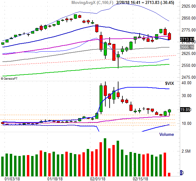
The kiss in this particular case is simply the slight brush the S&P 500 Volatility Index (VIX) made of its 50-day moving average line (purple) on Tuesday, only to follow through on that reversal effort on Wednesday. Though the VIX is supposed to only be a measure of anticipated volatility, in reality, it’s a fear gauge. When it’s rising, it’s generally bad for the market… and it’s rising.
The good news is, though the S&P 500 was in retreat mode again on Wednesday, there’s still a bastion of hope for it. It too has “kissed” its 20-day moving average line (blue) with Wednesday’s low, but didn’t slide under it. Maybe the bulls will draw a line in the sand there.
We can’t count on that, however.
There are several reasons for our doubt, one of which is Tuesday’s bar. It completely engulfed, and reversed Monday’s bullishness; the downside follow-through on Wednesday was the clincher. The other concern is that once again we saw fading volume on the way up, but we saw growing volume on the way down with Tuesday’s and Wednesday’s losses.
It’s not just the total volume we saw on Tuesday and Wednesday, however. We also know that the bearish volume (the amount of trading activity in stocks that ultimately lost ground on Wednesday) was far and away greater than the amount of bullish volume we saw.
If you’re a regular reader of BigTrends commentaries than you’ve seen this chart before. It’s a comparison of the S&P 500 to the NYSE’s total advances, total decliners, total up volume, and total down volume for any given day. The histogram bars plot the daily advancer, decliner, and up/down volume. The lines that drift along sideways on top of those histogram bars are moving averages of each datasets daily data. Sometimes (quite often, in fact), it’s the smoothed-out trend data that shows us which direction the undertow is pointed.