The good news is:
Breadth improved along with prices last week.
The Negatives The first chart covers the last 6 months showing the Nasdaq composite (OTC) in blue and a 10% trend (19 day EMA) of Nasdaq new highs (OTC NH) in green. Dashed vertical lines have been drawn on the 1st trading day of each month. OTC NH continued falling after failing to confirm the recent index high. 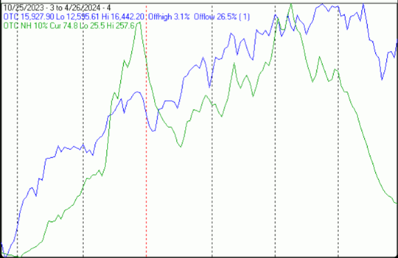 The next chart is similar to the one above except it shows the S&P 500 () in red and NY NH in green has been calculated with NYSE data. NY NH has been falling sharply since confirming the recent all time SPX high.
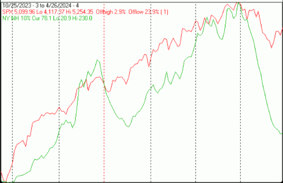 The next chart covers the past 6 months showing the OTC in blue and a 40% trend (4 day EMA) of Nasdaq new highs divided by new highs + new lows (OTC HL Ratio), in red. Dashed horizontal lines have been drawn at 10% levels for the indicator; the line is solid at the 50%, neutral level (equal numbers of new highs and new lows).OTC HL Ratio turned upward, but remains in deeply negative territory.
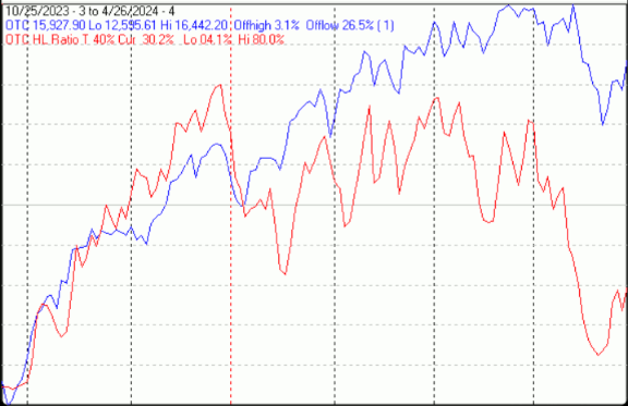 The PositivesThe next chart is similar to the one above except it shows the SPX in red and NY HL ratio, in blue, has been calculated with NYSE data.NY HLR after its record decline quickly returned to positive territory.
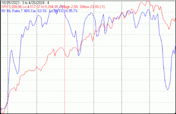 The next chart covers the past 6 months showing the OTC in blue and a 10% trend (19 day EMA) of Nasdaq new lows (OTC NL) in brown. OTC NL has been plotted on an inverted Y axis so decreasing numbers of new lows move the indicator upward (up is good). OTC NL the fall in this indicator has been arrested; its value at 166 remains uncomfortably high.
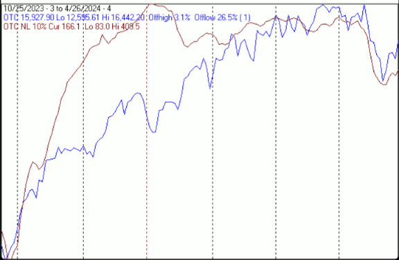 The next chart is similar to the one above except it shows the SPX in red and NY NL, in blue, has been calculated with NYSE data.NY NL the downward move in this indicator was arrested last week.
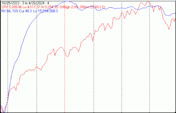 Summation indices are running totals of oscillator values.Short term momentum indicators applied to summation indices make them nearly binary.The next chart covers the past 6 months showing the S&P 500 (SPX) in red and momentum of summation indices of oscillators of advancing and declining issues, new highs and new lows and upside and downside volume on the NYSE. The NY SI Mom’s have all turned upward.
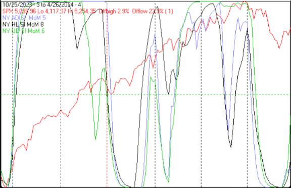 The next chart is similar to the one above; except it shows the Nasdaq composite (OTC), in blue and the SI’s have been generated from Nasdaq breadth data. Nasdaq SI’s 2 out of 3 are moving decisively upward.
 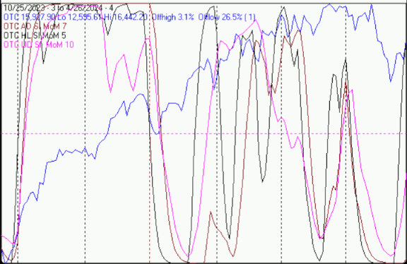 SeasonalityNext week includes the last 2 trading days of April and the first 3 trading days of May during the 4th year of the Presidential Cycle. The tables below show the daily change, on a percentage basis for that period. OTC data covers the period from 1963 to 2023 while SPX data runs from 1928 to 2023. There are summaries for both the 4th year of the Presidential Cycle and all years combined. Average returns for the coming week have been modest and mixed. Report for the last 2 days of April and first 3 days of May.The number following the year represents its position in the Presidential Cycle.The number following the daily return represents the day of the week;1 = Monday, 2 = Tuesday etc.
OTC Presidential Year 4 (PY4)
Day2 Day1 Day1 Day2 Day3 Totals
1964-4 0.57% 3 -0.49% 4 -0.05% 5 0.85% 1 -0.36% 2 0.52%
1968-4 0.30% 1 0.30% 2 0.00% 3 0.60% 4 1.39% 5 2.59%
1972-4 0.07% 4 0.24% 5 -0.89% 1 -0.63% 2 -0.44% 3 -1.65%
1976-4 0.28% 4 -0.52% 5 -1.14% 1 0.21% 2 0.00% 3 -1.17%
1980-4 0.58% 2 0.46% 3 -0.22% 4 0.41% 5 0.56% 1 1.79%
Avg 0.36% 0.00% -0.46% 0.29% 0.23% 0.42%
1984-4 0.39% 5 0.22% 1 1.15% 2 1.09% 3 -0.18% 4 2.67%
1988-4 0.03% 4 0.12% 5 0.13% 1 0.66% 2 -0.16% 3 0.78%
1992-4 1.72% 3 1.53% 4 -0.09% 5 0.93% 1 0.78% 2 4.87%
1996-4 0.11% 1 0.19% 2 0.77% 3 -1.78% 4 0.53% 5 -0.17%
2000-4 3.96% 4 2.30% 5 2.52% 1 -4.36% 2 -2.07% 3 2.36%
Avg 1.24% 0.87% 0.90% -0.69% -0.22% 2.10%
2004-4 -1.55% 4 -1.97% 5 0.97% 1 0.61% 2 0.35% 3 -1.60%
2008-4 0.07% 2 -0.55% 3 2.81% 4 -0.15% 5 -0.52% 1 1.67%
2012-4 0.61% 5 -0.74% 1 0.13% 2 0.31% 3 -1.16% 4 -0.85%
2016-4 -1.19% 4 -0.62% 5 0.88% 1 -1.13% 2 -0.79% 3 -2.85%
2020-4 3.57% 3 -0.28% 4 -3.20% 5 1.23% 1 1.13% 2 2.44%
Avg 0.30% -0.83% 0.32% 0.17% -0.20% -0.24%
OTC summary for PY4 1964 – 2020
Averages 0.63% 0.01% 0.25% -0.08% -0.06% 0.76%
% Winners 87% 53% 53% 67% 40% 60%
MDD 5/3/2000 6.34% — 4/30/2004 3.49% — 5/1/2020 3.47%
OTC summary for all years 1963 – 2023
Averages 0.32% 0.06% 0.27% 0.10% 0.10% 0.84%
% Winners 69% 59% 62% 66% 57% 64%
MDD 5/3/2000 6.34% — 5/3/2002 4.45% — 5/5/2010 4.36%
SPX PY4
Day2 Day1 Day1 Day2 Day3 Totals
1928-4 0.36% 6 0.00% 1 0.15% 2 0.25% 3 0.50% 4 1.26%
1932-4 -3.32% 5 0.00% 6 -1.54% 1 -1.39% 2 1.41% 3 -4.84%
1936-4 -2.94% 3 1.77% 4 0.73% 5 -0.50% 6 0.14% 1 -0.80%
1940-4 0.25% 1 0.58% 2 -1.31% 3 0.58% 4 0.17% 5 0.26%
1944-4 0.51% 5 0.00% 6 0.76% 1 -0.08% 2 0.67% 3 1.85%
1948-4 -0.32% 4 -0.26% 5 -0.26% 6 1.04% 1 -0.06% 2 0.13%
1952-4 -0.25% 2 -0.72% 3 -0.64% 4 1.68% 5 0.13% 6 0.19%
1956-4 1.05% 5 0.81% 1 -0.45% 2 0.02% 3 0.35% 4 1.78%
1960-4 -0.87% 4 -0.35% 5 -0.44% 1 1.29% 2 0.38% 3 0.01%
Avg 0.02% -0.10% -0.21% 0.79% 0.29% 0.79%
1964-4 -0.25% 3 -0.30% 4 0.89% 5 0.37% 1 0.51% 2 1.23%
1968-4 0.26% 1 0.13% 2 0.39% 3 0.63% 4 0.07% 5 1.48%
1972-4 0.15% 4 0.58% 5 -0.91% 1 -0.57% 2 -0.08% 3 -0.84%
1976-4 0.00% 4 -0.48% 5 -0.71% 1 0.50% 2 -0.53% 3 -1.23%
1980-4 0.21% 2 0.41% 3 -0.78% 4 0.11% 5 0.76% 1 0.71%
Avg 0.07% 0.07% -0.22% 0.21% 0.14% 0.27%
1984-4 -0.26% 5 0.10% 1 1.02% 2 0.14% 3 -0.43% 4 0.57%
1988-4 -0.45% 4 -0.49% 5 0.09% 1 0.55% 2 -1.02% 3 -1.32%
1992-4 0.71% 3 0.71% 4 -0.58% 5 1.06% 1 -0.02% 2 1.88%
1996-4 0.11% 1 0.00% 2 0.06% 3 -1.71% 4 -0.27% 5 -1.81%
2000-4 0.27% 4 -0.85% 5 1.09% 1 -1.50% 2 -2.16% 3 -3.15%
Avg 0.07% -0.11% 0.34% -0.29% -0.78% -0.77%
2004-4 -0.76% 4 -0.59% 5 0.92% 1 0.18% 2 0.18% 3 -0.07%
2008-4 -0.39% 2 -0.38% 3 1.71% 4 0.32% 5 -0.45% 1 0.81%
2012-4 0.24% 5 -0.39% 1 0.57% 2 -0.25% 3 -0.77% 4 -0.60%
2016-4 -0.92% 4 -0.51% 5 0.78% 1 -0.87% 2 -0.59% 3 -2.11%
2020-4 2.66% 3 -0.92% 4 -2.81% 5 0.42% 1 0.90% 2 0.26%
Avg 0.17% -0.56% 0.24% -0.04% -0.15% -0.34%
SPX summary for PY4 1928 – 2020
Averages -0.17% -0.05% -0.05% 0.10% -0.01% -0.18%
% Winners 50% 33% 54% 67% 54% 58%
MDD 5/3/1932 6.14% — 5/1/2020 3.70% — 5/3/2000 3.62%
SPX summary for all years 1928 – 2023
Averages 0.06% 0.16% 0.08% 0.13% 0.22% 0.65%
% Winners 54% 56% 55% 66% 63% 66%
MDD 5/3/1930 8.27% — 5/3/1932 6.14% — 5/2/1934 5.09% MaySince 1963, over all years, the OTC in May has been up 61% of the time with an average gain of 0.7%. During the 4th year of the Presidential Cycle May has been up 67% time with an average gain of 0.6%. The best May ever for the OTC was 1997 (+11.1%), the worst 1970 (-13.0%).The average month has 21 trading days. The chart below has been calculated by averaging the daily percentage change of the OTC for each of the 1st 11 trading days and each of the last 10. In months when there were more than 21 trading days some of the days in the middle were not counted. In months when there were less than 21 trading days some of the days in the middle of the month were counted twice. Dashed vertical lines have been drawn after the 1st trading day and at 5 trading day intervals after that. The line is solid on the 11th trading day, the dividing point.In the chart below, the blue line shows the average of the OTC in May over all years since 1963 while the green line shows the average during the 4th year of the Presidential Cycle over the same period.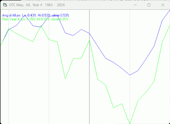 Since 1928 the SPX has been up 59% of the time in May with an average loss of -0.1%. During the 4th year of the Presidential Cycle the SPX has been up 71% of the time with an average loss of -1.1% (helped considerably by losses of 23.3% and 24.0% in 1932 and 1940 respectively). The best May ever for the SPX was 1933 (+15.9%) the worst 1940 (-24.0%). The SPX has not had a double digit % move, either way, in May since 1940.The chart below is similar to the one above except it shows the daily average performance over all years for the SPX in May in red and the performance during the 4th year of the Presidential Cycle in green.
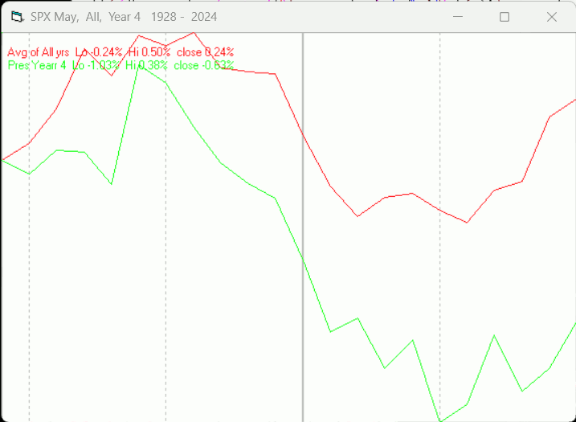 Since 1979 the Russell 2000 (R2K) has been up 62% of the time in May with an average gain of 1.2%. During the 4th year of the Presidential Cycle the R2K has been up 64% of the time with an average gain of 0.6%. The best May ever for the R2K, 1997 (+11.0%), the worst 2019 (-7.9%)The chart below is similar to those above except it shows the daily performance over all years of the R2K in May in magenta and the performance during the 4th year of the Presidential Cycle in green.
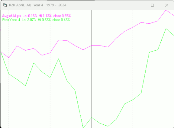 Since 1885 the Dow Jones Industrial Average (DJIA) has been up 53% of the time in May with an average loss of -0.1%. During the 4th year of the Presidential Cycle the DJIA has been up 44% of the time in May with an average loss of -1.3%. The best May ever for the DJIA 1898 (+14.7%), the worst 1940 (-21.7%)The chart below is similar to those above except it shows the daily performance over all years of the DJIA in May in blue and the performance during the 4th year of the Presidential Cycle in green.
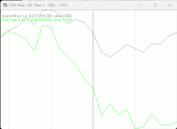 ConclusionThe market had a pretty good week. Prices and breadth both improved. The strongest sectors last week were Precious Metals (for the 5th week in a row) and Utilities (for the 2nd week) while the weakest were Transportation and Energy services.I expect the major averages to be higher on Friday, May 3 than they were on Friday, April 26.