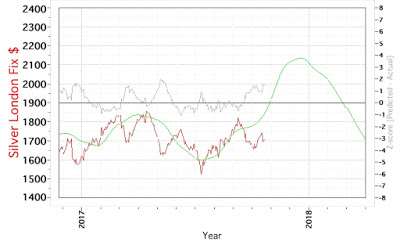
Silver Cycle Model Chart
2018.01.11 Silver Cycle Model Chart
This is the same model, and I thought it might not converge since it took more iterations than average, but it clearly shows, if it is correct, that the price has reached a local maximum at the beginning of this year. Going forward, we should expect to see lower silver prices. As can happen with these kinds of models, the local maximum may have been predicted relatively well in time, however, the magnitude was much lower than expected.
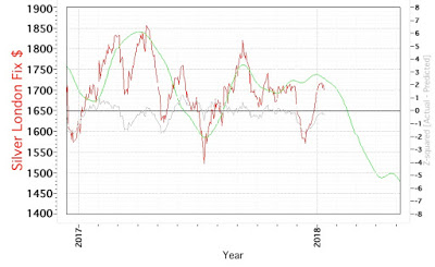
The previous iteration can be found here and below.
2017.10.20 Silver Cycle Model Chart