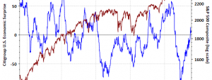
This morning’s release of the publicly available data from ECRI puts its Weekly Leading Index (WLI) at 148.2, up 0.2 from the previous week. Year-over-year the four-week moving average of the indicator is now at 2.91%, down from 3.12% last week. The WLI Growth indicator is now at 3.9, down from the previous week.
“Up is Down: Jump in AHE Growth Confirms Economic Slowdown”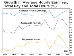
ECRI’s most recent self-published article briefly discusses the Average Hourly Earnings (AHE) and its recent increase but emphasizes the cause. AHE is a ratio: total weekly pay to total weekly hours. The increase in AHE is a result of a faster decline in weekly hours than weekly pay, thus making AHE rise and seemingly good for the economy. The truth of the matter is that it confirms a slowdown in economic growth. Read more here
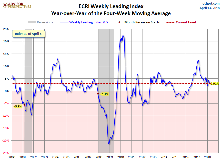
The ECRI Indicator Year-over-Year
Below is a chart of ECRI’s smoothed year-over-year percent change since 2000 of their weekly leading index. The latest level is above where it was at the start of the last recession.
(Click on image to enlarge)
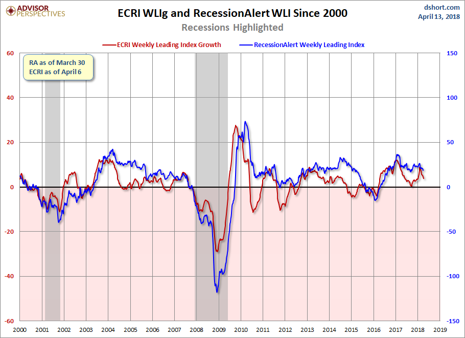
RecessionAlert has launched an alternative to ECRI’s WLIg, the Weekly Leading Economic Indicator (WLEI), which uses 50 different time series from various categories, including the Corporate Bond Composite, Treasury Bond Composite, Stock Market Composite, Labor Market Composite, and Credit Market Composite. An interesting point to notice — back in 2011, ECRI made an erroneous recession call, while the WLEI did not trigger such a premature call. However, both indicators are now generally in agreement and moving in the same direction. Frequently the latest RecessionAlert data is not available at publish time and will be posted at a later point.
(Click on image to enlarge)
Appendix: A Closer Look at the ECRI Index
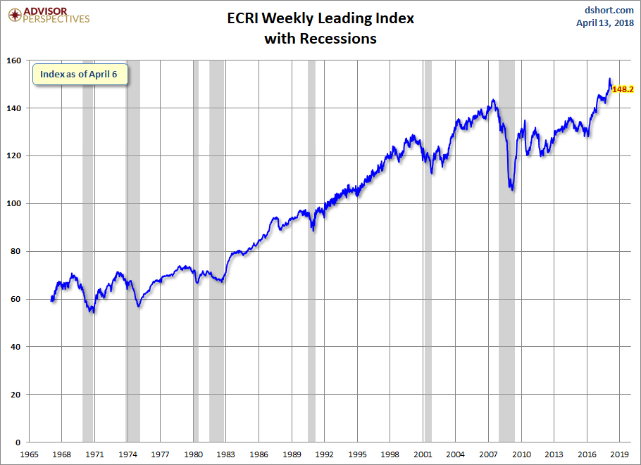
The first chart below shows the history of the Weekly Leading Index and highlights its current level.
(Click on image to enlarge)
For a better understanding of the relationship of the WLI level to recessions, the next chart shows the data series in terms of the percent-off the previous peak. In other words, new weekly highs register at 100%, with subsequent declines plotted accordingly.